Chart overview
Once I had the trips recorded using the Car Scanner app, I wanted to visualise the data in a way that would allow me to see the correlation between the different sensors and the DPF soot level.
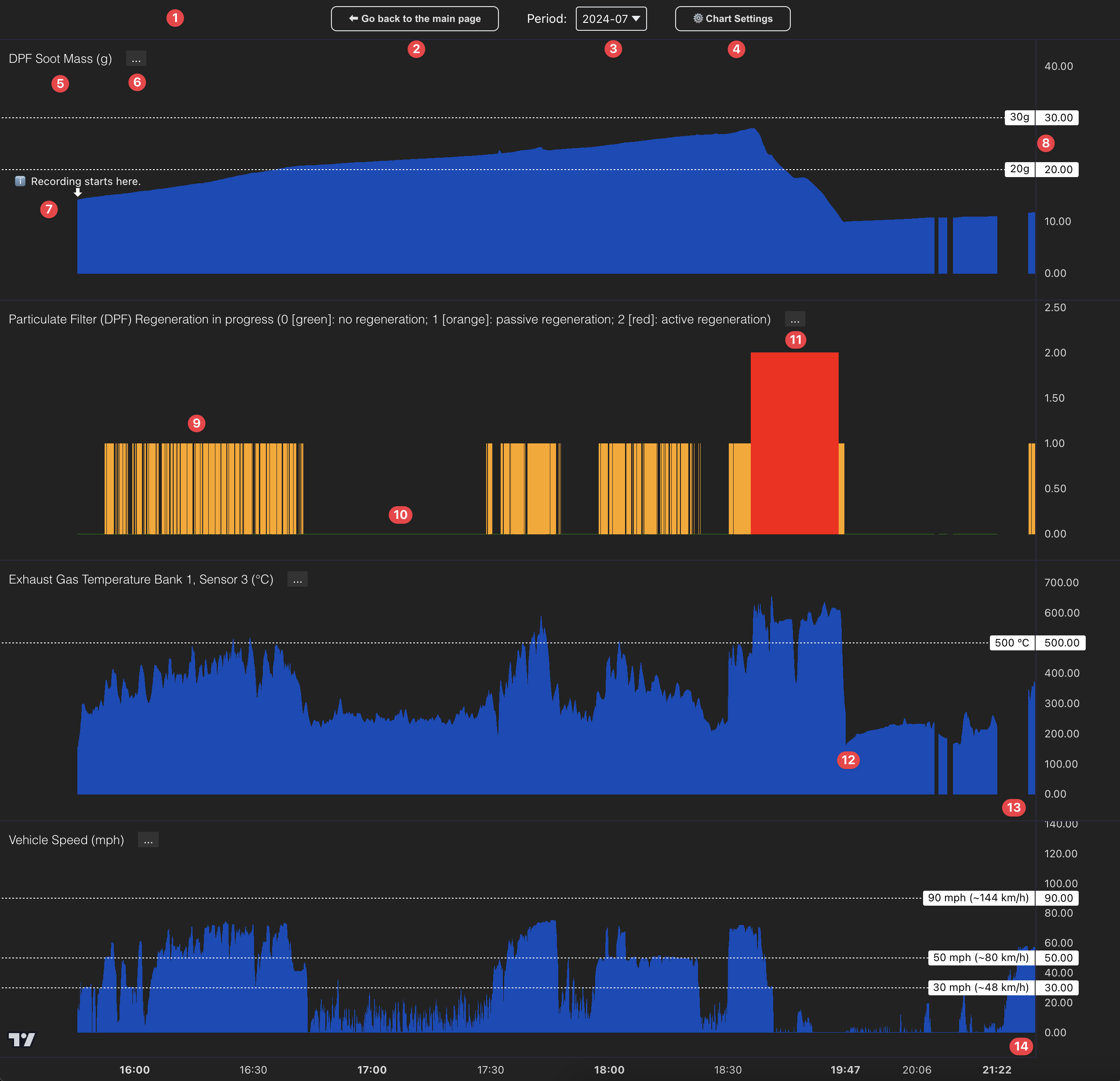
And thus, the SootScout Chart was born:

- This is the toolbar. It is placed above the charts and it contains the following elements: "Go back to the main page" button (2), a Period selector dropdown (3), and a Chart Settings button (4).
- This button allows you to go back to the main page of the SootScout.com website.
- The Period dropdown allows you to select the period for which you want to see the data. The data is broken up into 1-month periods. By default, July 2024 is selected (
2024-07), which is the month I started recording the data. If you select a different period, the charts will update to show the data for that period. - The Chart Settings button opens a modal where you can configure the charts you want to see on the page. By default, the following charts are selected:
DPF Soot Mass (g),Particulate Filter DPF Regeneration,Exhaust Gas Temperature Bank 1, Sensor 3 (°C),Vehicle Speed (mph)andDistance travelled (miles). - This is the title of the topmost chart on the page (there are 4 charts displayed in total). It shows the DPF Soot Mass in grams over time.
- The
...button displayed next to each chart's name is a dropdown menu that allows you to move the chart to a different position on the page or remove it from the page. - The marker points to the first available data point. There is no data before this point.
- The Y-axis shows the DPF Soot Mass in grams. Each chart has its own Y-axis showing the data specific to that chart. Some charts have horizontal lines drawn over at specific values, such as the
DPF Soot Mass (g)chart, which has a line drawn at 20g and 30g. Note that there is nothing special about 20 or 30g of DPF Soot Mass. These are displayed only to give the viewer a reference point. - The green/orange/red bars on the 2nd chart represent the DPF Regeneration status. Here, lots of subsequent orange bars indicate that the car was busy trying to do passive regeneration. Take a look at the
Vehicle Speed (mph)chart at the bottom for the same period, I was mostly driving above 50mph at this point, hence the reason for the passive regeneration attempts. - After the first set of passive regenerations (15:50-16:42, orange bars with value "1"), you can see car decided it did not want to continue with the regenerations, hence the many green bars with value "0" for several minutes. This is when I got into traffic on the motorway and the car could not maintain the required speed for passive regeneration to take place.
- Once the speed picked up again, the car continued trying to do passive regeneration, but it was not successful in bringing the DPF Soot Mass down, and therefore, as a last resort, it started doing active regeneration (red bars with value "2"). You can see how the DPF Soot Mass started to rapidly decrease after the active regeneration started. Observe that when the car was doing passive regeneration, the exhaust gas temperature was unable to reach the required temperature for the soot to burn off. It is only when the car started doing active regeneration that the exhaust gas temperature reached the required level. I believe this is one of the reasons JLR is being sued for DPF issues on the Discovery Sport. Normal driving conditions do not allow the DPF to reach the required temperature for passive regeneration to make any effect.
- Notice the sudden drop in exhaust gas temperature following the active regeneration at around 18:59. This was the moment when I turned off the engine and stopped recording. When I turned the engine back on at 19:47 I resumed recording, and you can see how the exhaust gas temperature started to rise again. Note that there is no visible gap on the chart between 18:59 (when I stopped recording) and 19:47 (when I resumed recording), each recording is displayed right after the previous one. You can use the sudden drop in exhaust gas temperature as a reference point to see where the recordings stopped and resumed. There may be several minutes, hours or days gaps between recordings, but these gaps are not displayed on the chart.
- Now about these visible gaps in the recording on certain charts... Unfortunately, the Car Scanner app seem to be working intermittently when it is placed in the background, and there are several instances where the app stopped recording data for several minutes. This is why you see these gaps in the data. Once I have noticed this intermittent recording behaviour, I made sure to keep the app in the foreground when I was driving, and this is why you see fewer gaps in the data in my later recordings. Interestingly, backgrounded or not, the app was still able to record some data, such as the Vehicle Speed (take a look at the chart below). I don't understand why the app was able to record some data but not others, but I am not a developer, so I can't really comment on this.
- Finally, at the bottom of the screen you find the time axis showing down to the second (when zoomed in) when each data point was recorded.
Interacting with the charts
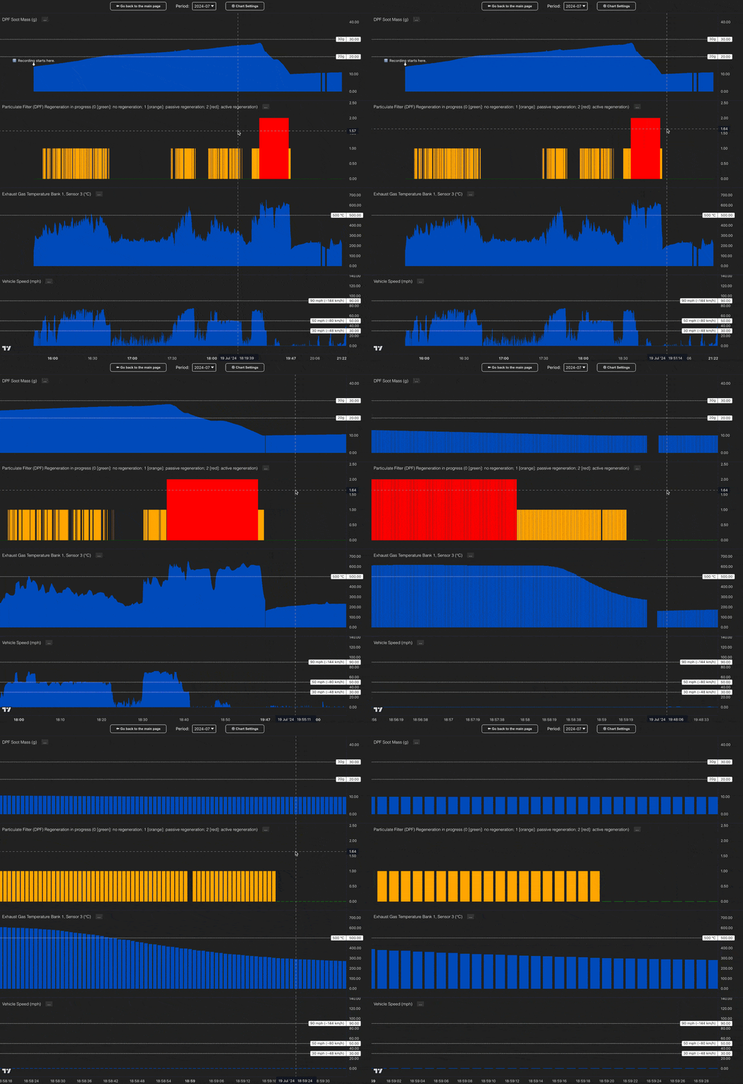
By zooming into the charts, you can see the recorded data points in more detail. Here is an animation demonstrating how I used my computer's touchpad to zoom into the charts:

Each bar on the chart represents a single snapshot of the data recorded by the Car Scanner app. The data is recorded every few seconds. For example in the animation above I zoomed onto the chart to see the data points recorded in each second at 18:59.
To zoom in, I simply scrolled up on my laptop's touchpad. If you are using a mouse, you should be able to use the scroll wheel to zoom in and out.
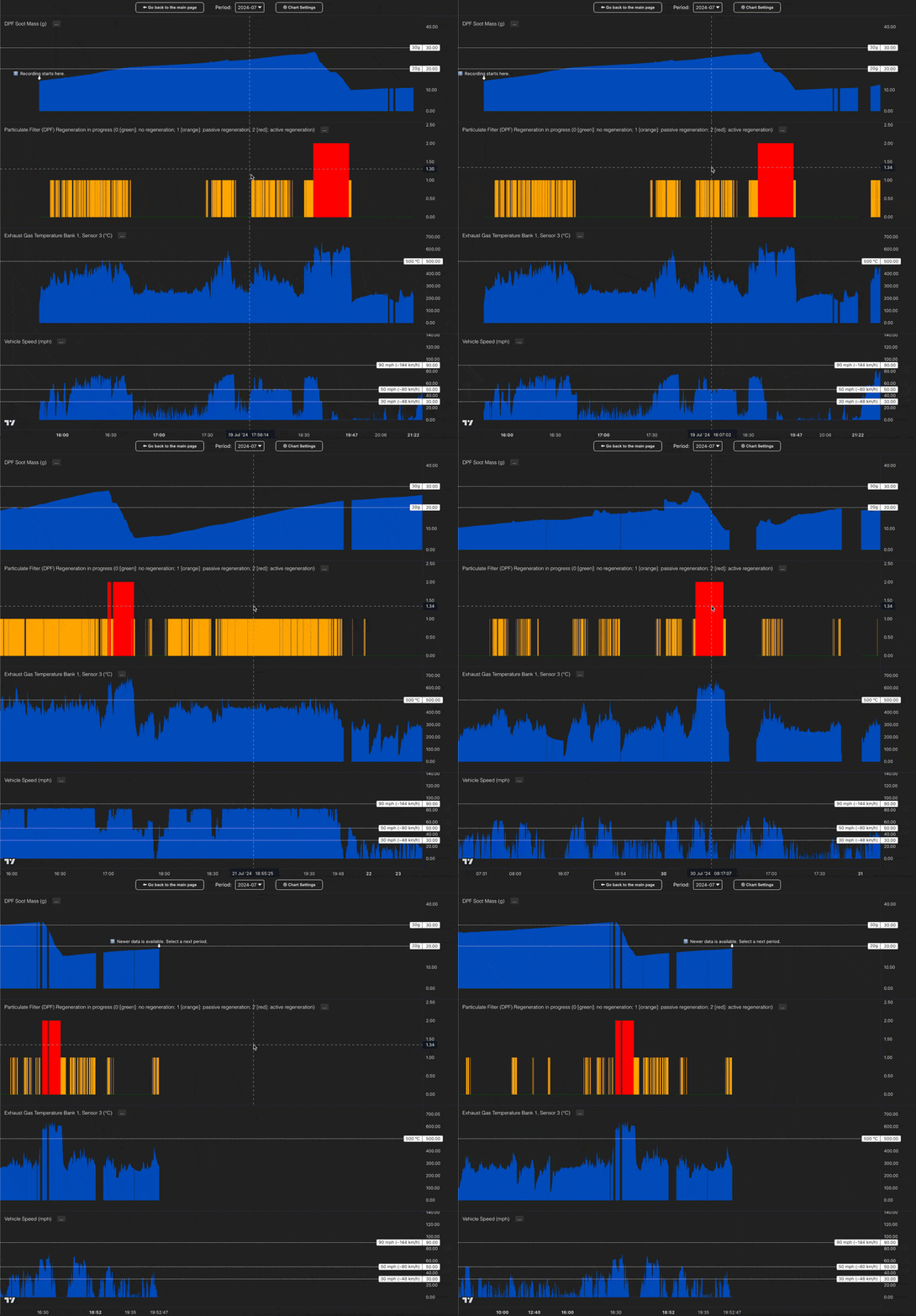
The charts can be panned as well using the same technique. To pan, I simply used the touchpad to scroll left and right, moving through time:

In case you struggle with zooming or panning with the mouse, you can also use the keyboard arrow keys. Click inside one of the charts to place the focus on it, and then use the arrow keys to pan left, right, up, and down. To zoom in or out, use the up and down arrow keys. To pan left or right, use the left and right arrow keys. Pressing the Shift key while using the arrow keys will increase the pan or zoom speed.
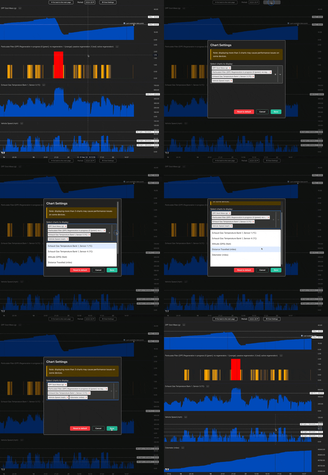
Finally, here is an animation demonstrating how I used the Chart Settings modal to configure which charts I wanted to see on the page:

Note that the charts are very "memory-hungry" (each display hundreds of thousands of data points) and the charts page may not work well on devices with a very limited amount of memory. If you experience any performance issues (charts not loading, or browser crashing), please try removing some of the charts from the page using the Chart Settings modal.
Available charts
The following charts are available to be displayed on the SootScout Chart page:
DPF Soot Mass (g): This chart shows the DPF Soot Mass in grams over time. The DPF Soot Mass is the amount of soot accumulated in the DPF. The higher the value, the more soot is in the DPF. My observations show that the car usually allows the soot to grow to about 30g before it decides to do an active regeneration as a last resort.Particulate Filter DPF Regeneration: This chart shows the DPF Regeneration status over time. The DPF can go through 3 different regeneration processes: no regeneration (0), passive regeneration (1), and active regeneration (2).Exhaust Gas Temperature Bank 1, Sensor 1 (°C): This chart shows the Exhaust Gas Temperature in degrees Celsius over time as it exits the engine. On my Land Rover Discovery Sport this exhaust gas still has to travel through a long pipework to reach the DPF. To see how hot the exhaust gas is as it enters the DPF, see Exhaust Gas Temperature Bank 1, Sensor 3.Exhaust Gas Temperature Bank 1, Sensor 3 (°C): This chart shows the Exhaust Gas Temperature in degrees Celsius over time as it enters the DPF. Whatever happened to Sensor 2? For some reason Car Scanner would show N/A for Sensor 2, I assume this is something that is not available on my car.Exhaust Gas Temperature Bank 1, Sensor 4 (°C): This chart shows the Exhaust Gas Temperature in degrees Celsius over time as it exits the DPF.Vehicle Speed (mph): This chart shows the Vehicle Speed in miles per hour over time. As with every car, the speed displayed on the dashboard is off by a few mph, and therefore driving at about 75mph on the motorway is actually 70mph according to the GPS (and speed cameras). Also, keep in mind that I drove in a numerous continental European countries where the speed limits are different than in the UK, so you will see the speed going up to (and above) 130km/h (~80mph) in some cases, especially while driving on the German Autobahn (where there is no speed limit).Altitude (GPS) (feet): This chart shows the Altitude in feet over time. The altitude is recorded by the GPS in the Car Scanner app. The altitude is not very accurate, and it is mostly used to determine the elevation change during a trip. For some reason the recording of the altitude was not very consistent until the end of August, so you will find most trips missing the altitude data before that date.Distance travelled (miles): This chart shows the Distance travelled in miles per each recording. Every time I started a new recording in the Car Scanner app, the distance travelled counter was reset to 0. Looking at this chart should help you understand when each recording was started & stopped. There is a caveat with this chart though. If, for whatever reason the recording was stopped halfway through the trip, and then immediately started again, the distance travelled was reset to 0. This means, that on some trips you will see the distance travelled being reset to 0, even though the trip was continuous. At some point I was experimenting with the app (to combat the "data not recording" issue), and I stopped and started the recording several times during the same trip, which is why you see the distance travelled being reset to 0 several times in a row. Even with this caveat, the chart should give you a good idea of when the recordings were started & stopped.Total distance travelled (miles): This chart shows the Distance travelled in miles over time. Note that it is the distance travelled while the app was recording. If the app was not recording a particular trip (some short trips I did not record), the distance travelled did not increase. When I noticed this, I started recording Odometer data as well, which accurately reflects the actual distance travelled by the char between recordings.Odometer (miles): This chart shows the Odometer reading in miles over time. The Odometer reading is the total distance travelled by the car since it was new. I have only begin recording the Odometer data in September 2024, so there is no odometer data before that date (see the note above about theDistance travelledchart).
Now, that you understand how to interact with the charts, let's dive into the data and see what we can learn from it. Click here to open the first analysis: 2024-07.